Term Explaination
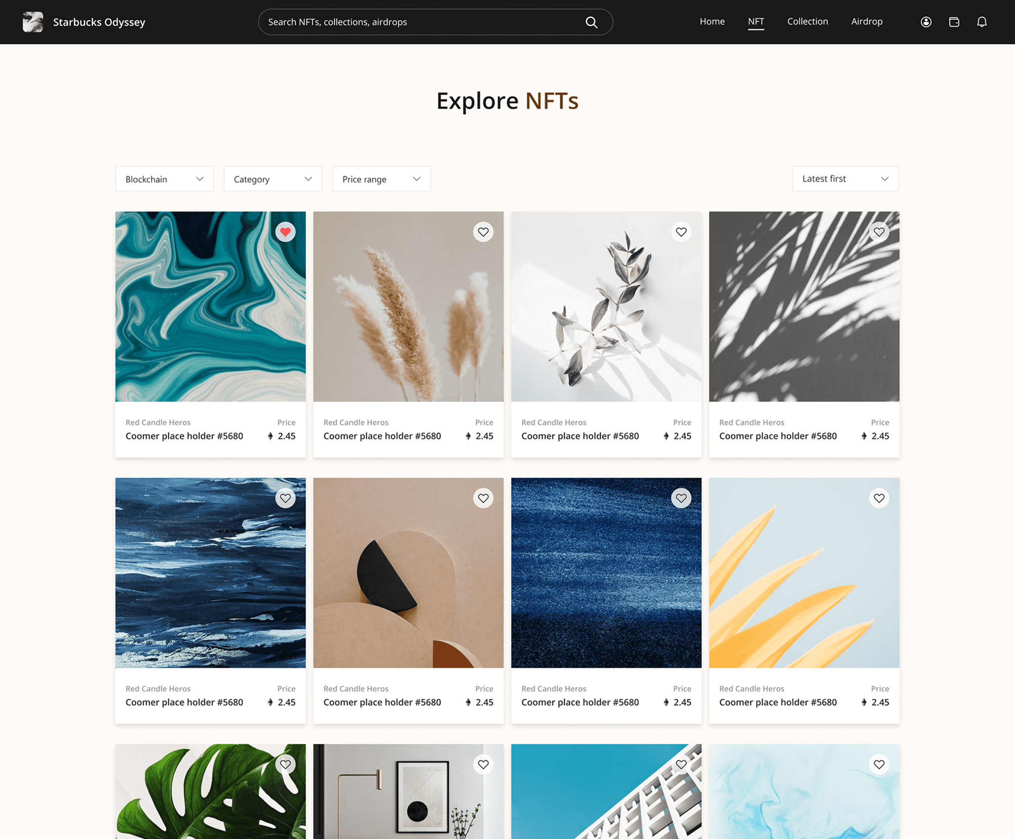
Non-fungible tokens (NFT) are unique blockchain assets representing specific digital items—often artistically-designed works in a consistent collection style. The following shows example NFTs from the collection One Night in August by artist Natasha Chomko.
NFT
/
Shadow of a Doubt
NFT
/
House of Ballons, 2020
What is PowerNFT?
PowerNFT is a one-stop B2B platform developed by Microsoft, enabling Web3 brands to create, manage, and sell NFTs.

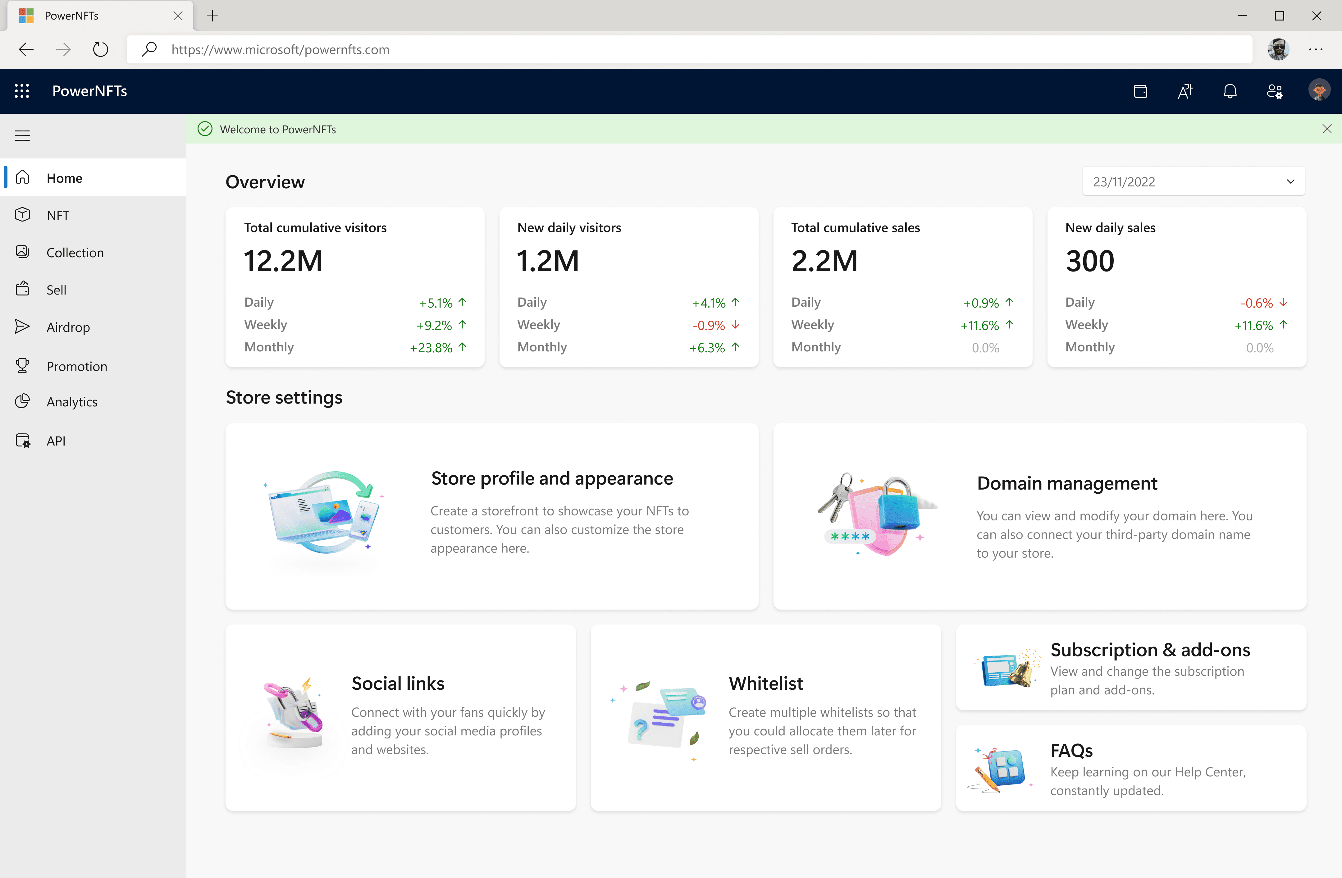
Storefront Framework
To streamline NFT trading, PowerNFT runs a marketplace with a standardized storefront framework, in which onboarded businesses can publish their NFTs for sale and launch marketing campaigns.


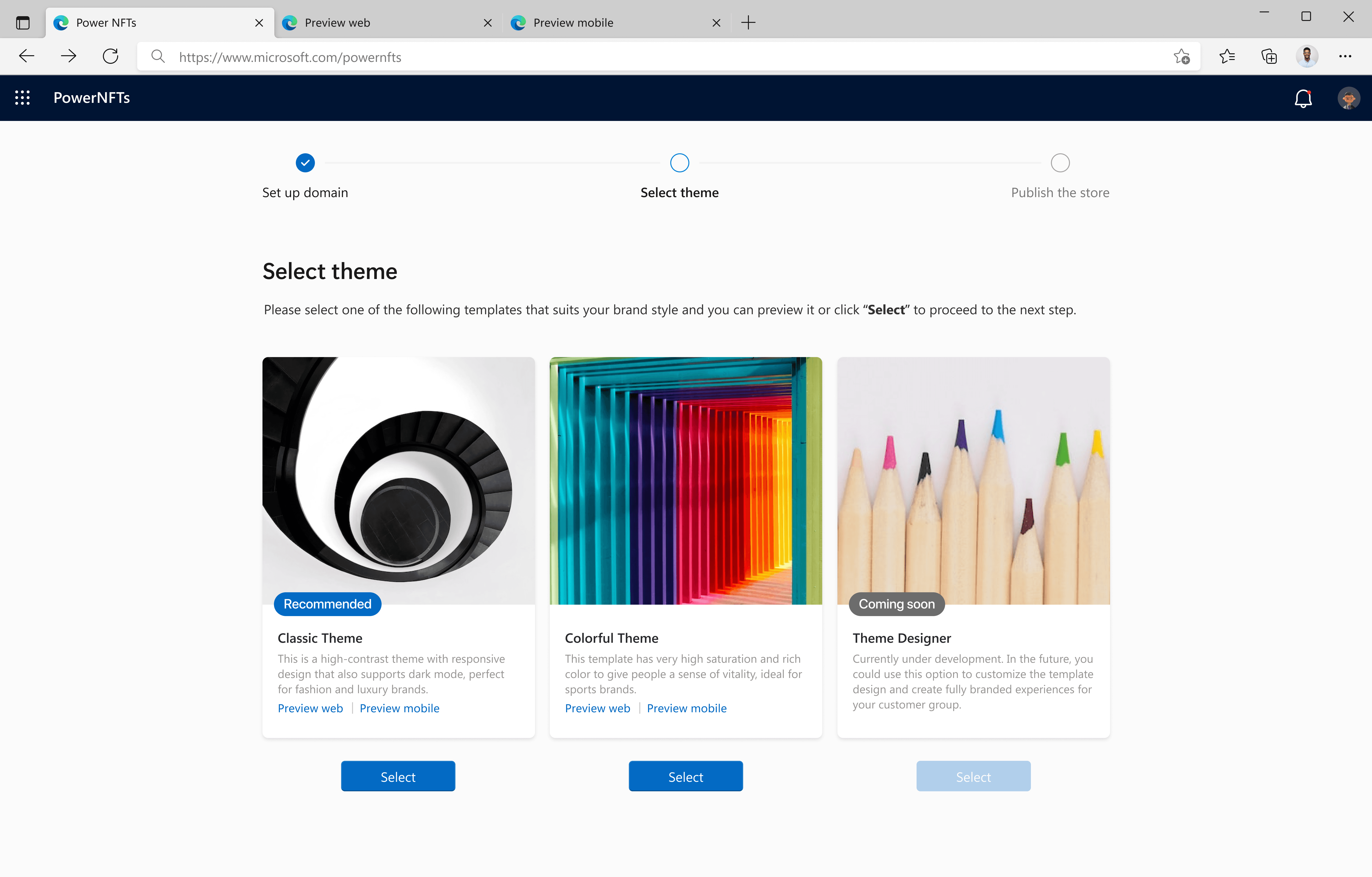
Storefront Setup
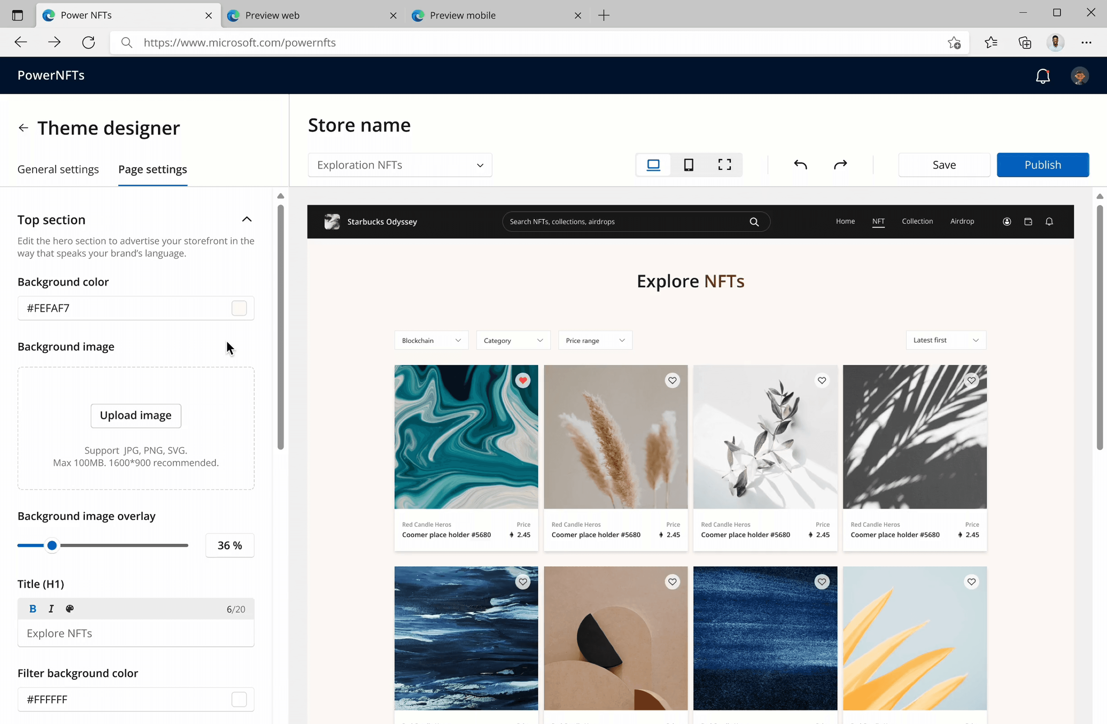
Before listing NFTs, Web3 brands need to complete a storefront setup flow on PowerNFT. In the process, they pick a theme aligned to their business domain; the chosen theme will then be applied across the entire storefront.
PowerNFT
/
Store Configuration Flow
Dual Store Themes
Prior to Theme Designer, PowerNFT only offered 2 storefront theme templates for all brands to choose. Each template featured a unique visual style and was created to suit specific types of business.
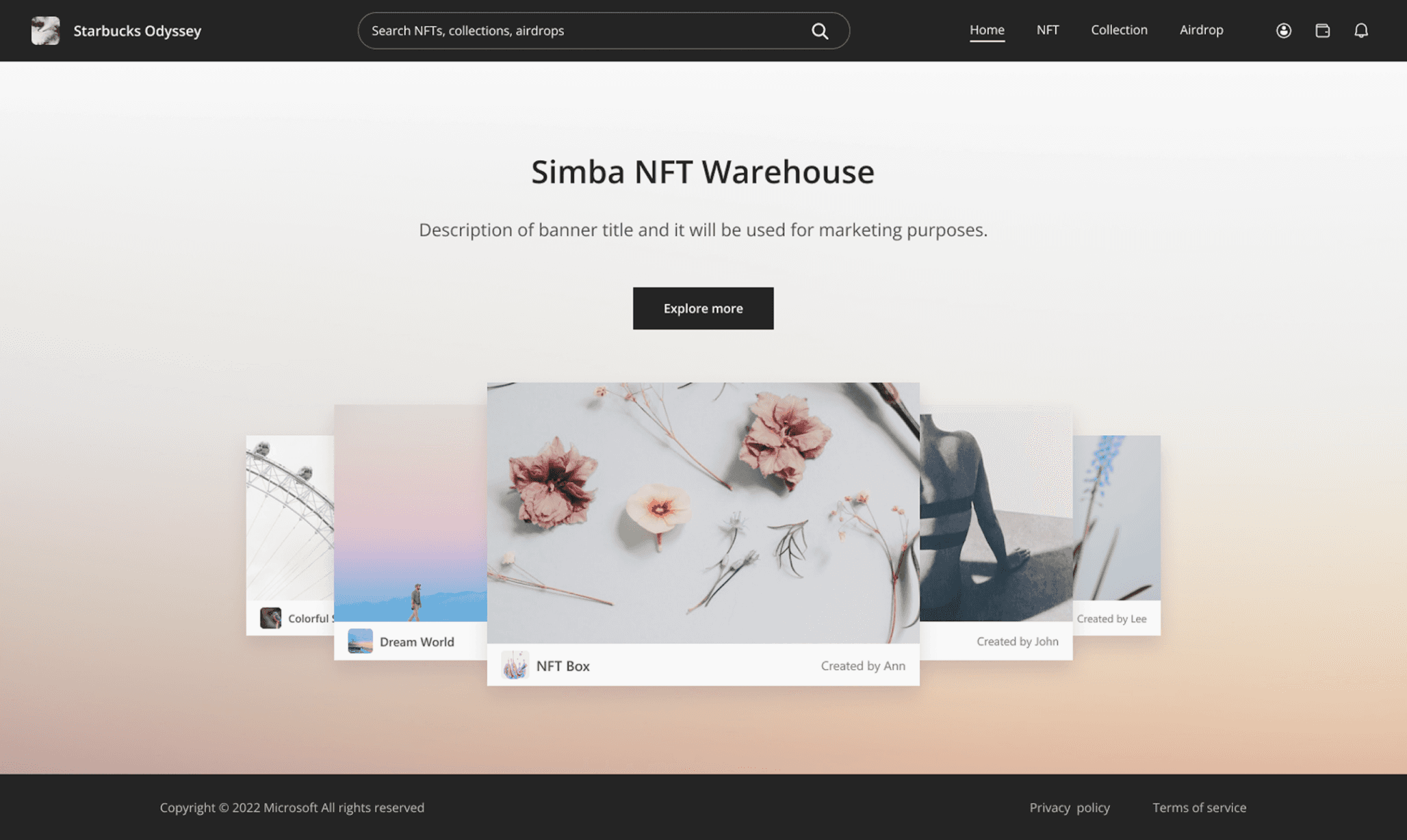
Storefront
/
Classic Theme
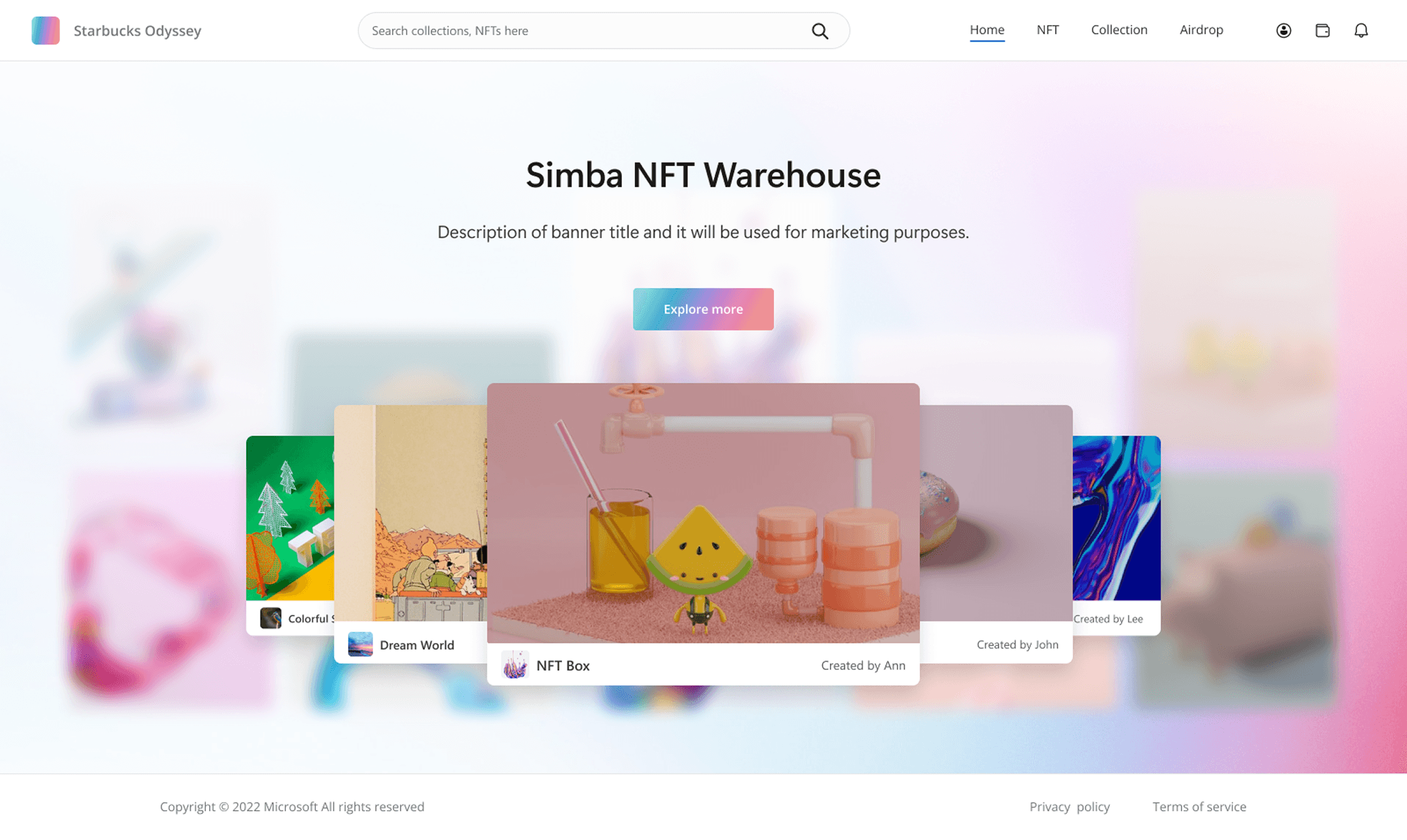
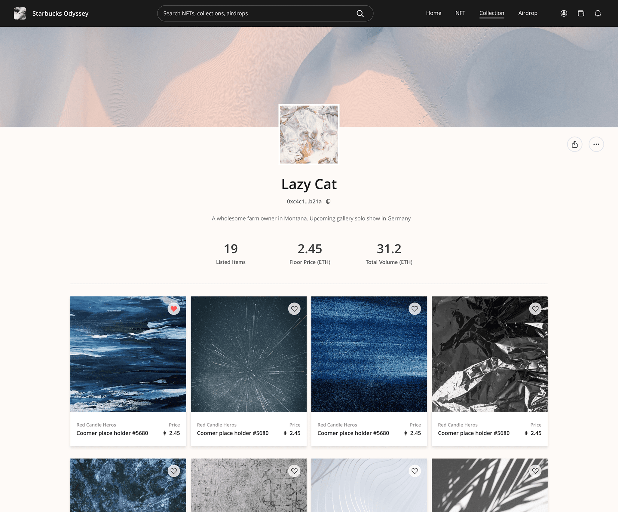
Storefront
/
Colorful Theme
Templates Falling Short
However, many brands came in with their existing visual identities and found the preset storefront styles limiting. As such, they demanded more flexibility to tailor themes to match their branding.

User Needs
Based on client input, we distilled the core needs for theme customization and targeted brand store admins as the main users in charge of storefront creation, maintenance, and editing.
Differentiation
Alignment
Ease of Use

Design Strategy
Theme Designer adopted a top-down design strategy on theme customization. The “top” part covers general settings such as color palette and typography. It helps admins apply style changes across the store, ensuring high efficiency.
The "down" part handles page-specific elements—like text and CTA labels that can vary by page. This enables local edits while keeping other elements intact, granting store admins more flexibility at the page level.

Theme Designer
/
Design Strategy
General Settings
In general settings, I focused on the following categories since they appear on every page and are easy to scale globally.
Adjust colors at scale—buttons, text, and more
Template Selection
To start, admins can pick a default theme from the left panel. Each will provide presets to serve as a styling baseline, avoiding full manual setup.

General Settings
/
Theme Selection
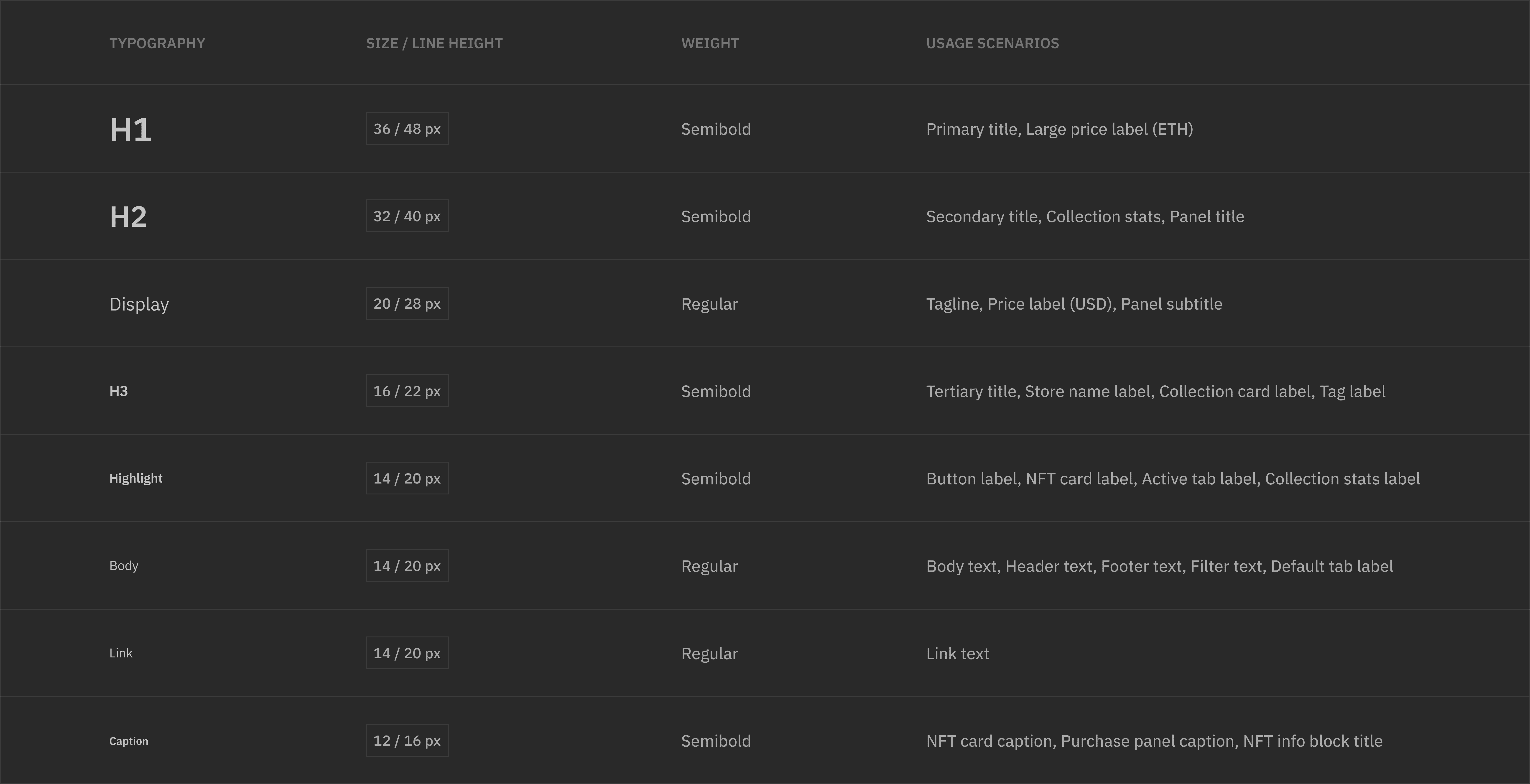
Store Text Hierarchy
Before delving into typography settings, I dissected every storefront page and categorized all the text elements based on hierarchy and semantics, assigning labels ranging from “H1” all the way to “Caption” to each category.
General Settings
/
Text Hierarchy
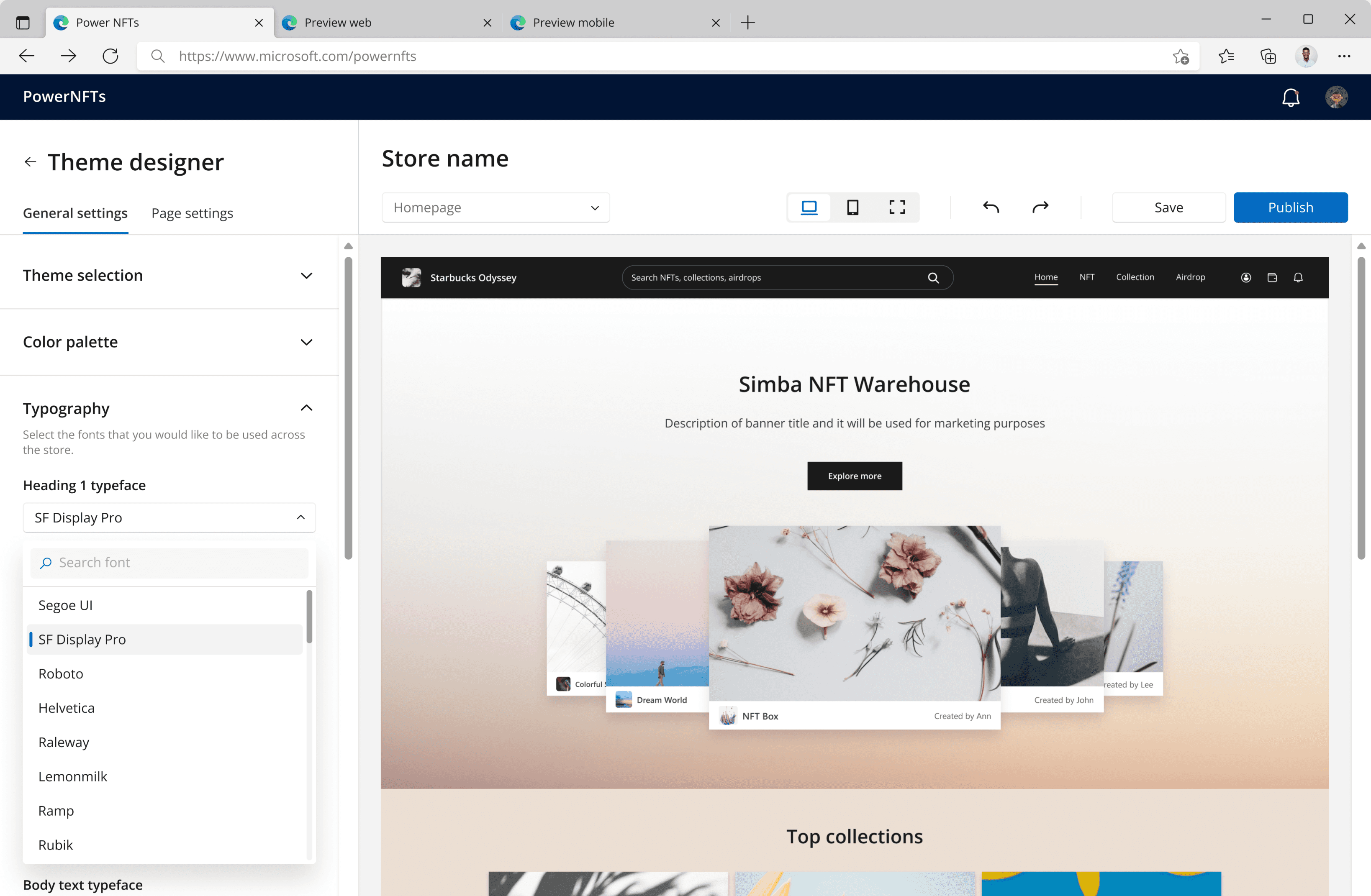
Typography Settings
The text hierarchy served as guidance for designing typography settings. Each typeface dropdown corresponds to one text category, allowing admins to pick the preferred fonts for various text elements across the store.
General Settings
/
Typography Settings
Color Settings
Color settings help admins change colors on different elements, including text, buttons, and page backgrounds.
General Settings
/
Color Settings
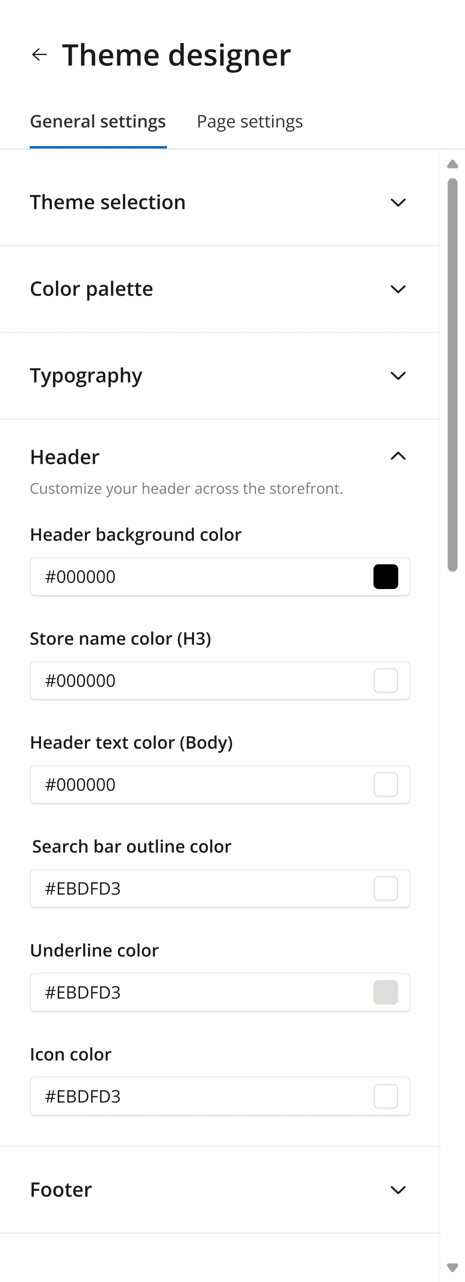
Header/Footer Settings
Header and footer settings enable admins to customize various components in the header and footer, such as background color, icon, and search bar.
General Settings
/
Header

General Settings
/
Footer
Page Settings
For page settings, I identified six categories, including text, page background, buttons, card grid, carousel, and other settings such as tags and filters.

Page Settings
/
Setting Categories
Text Editing
In text settings, admins can edit copy content through a text editor. Formatting tools are also available to make text bold, italic or change its color.
Page Settings
/
Text Settings
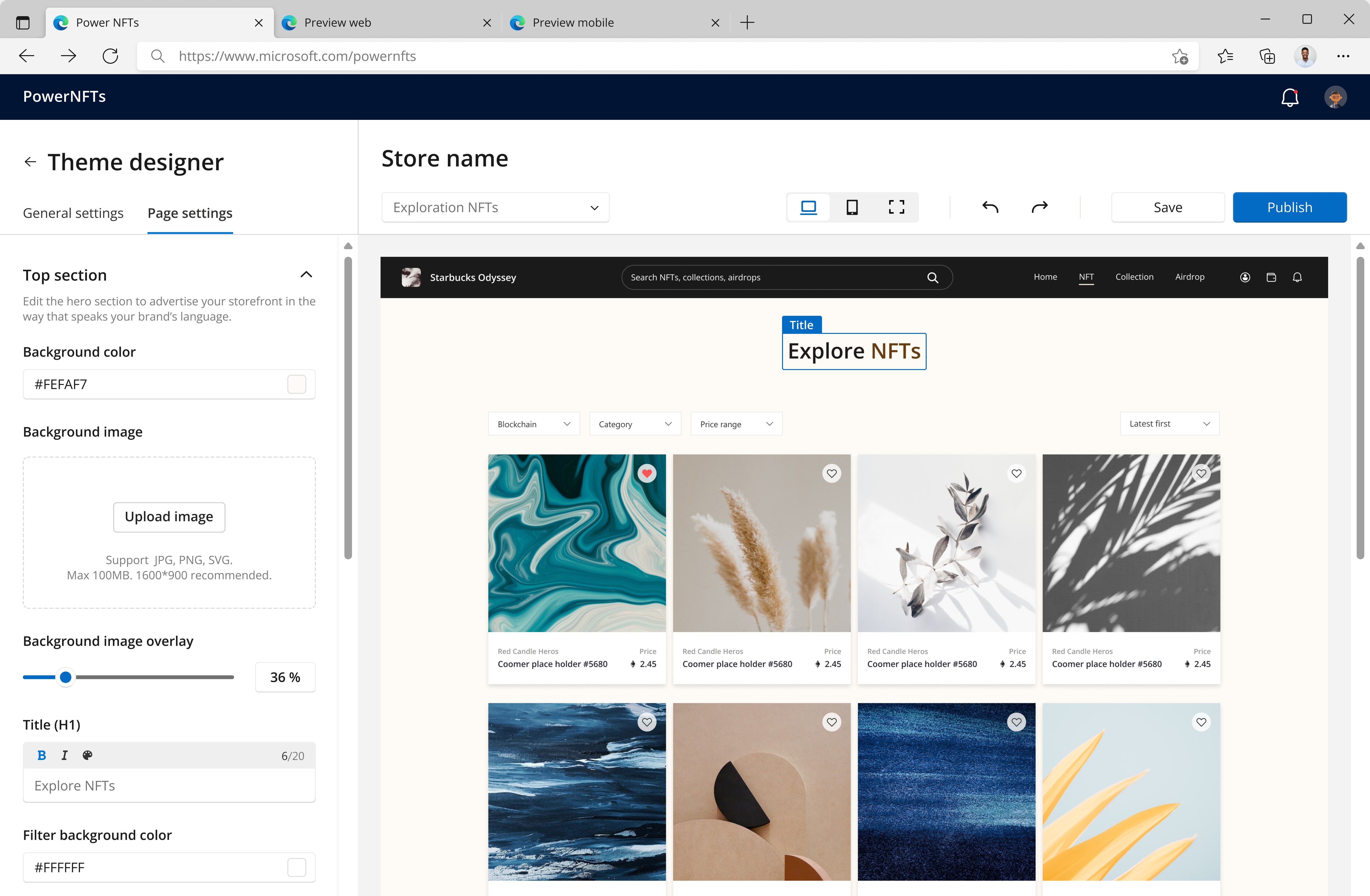
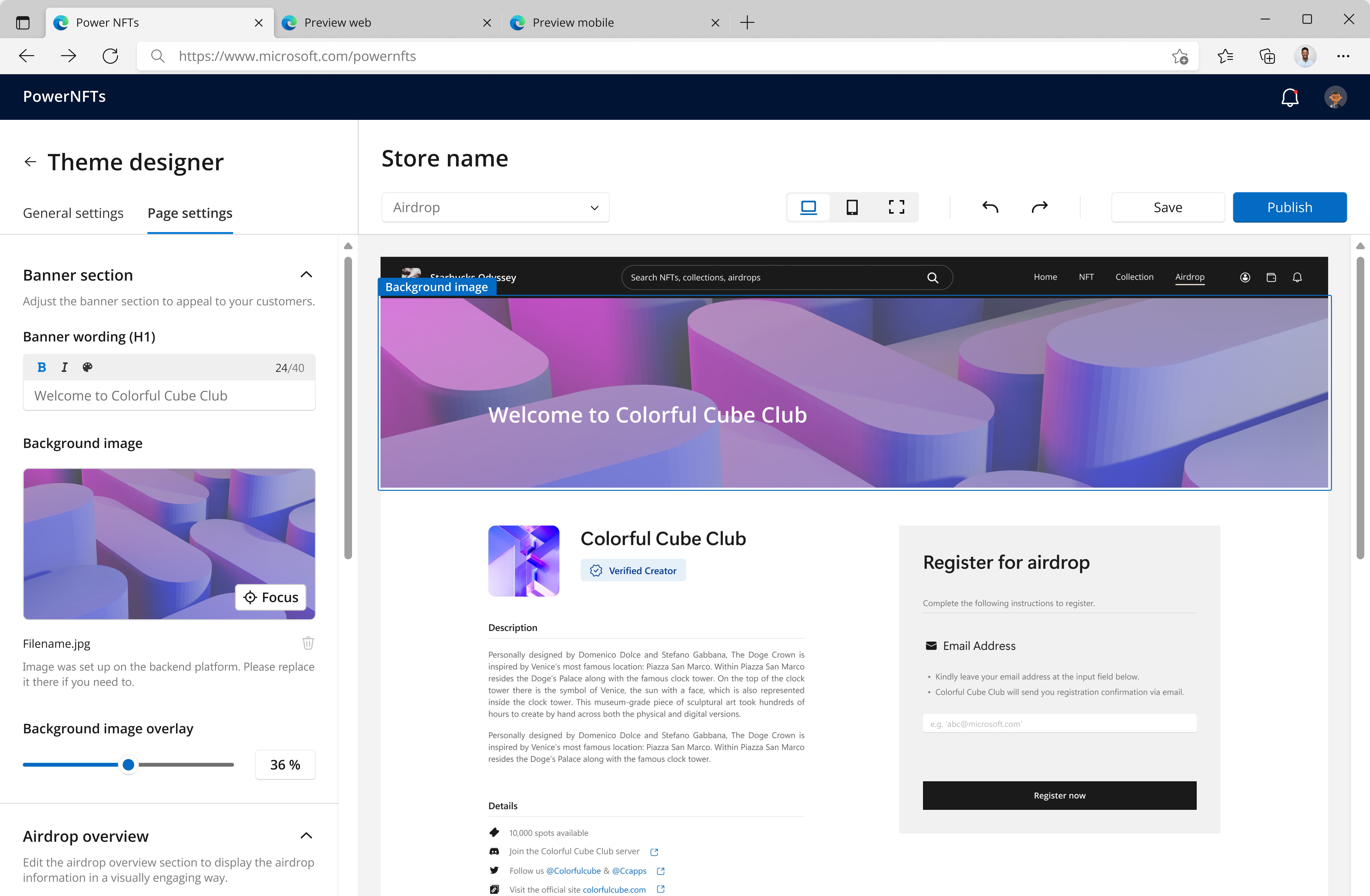
Page Background
Admins can fill backgrounds with a color or image. The image overlay feature helps keep proper contrast when text sits on the image, while the focal point control lets admins choose which part of the image stays in view.
Page Settings
/
Background Settings
Button Settings
In button settings, admins can edit the label, adjust fill and border styles, and set the destination to an internal page or external URL.
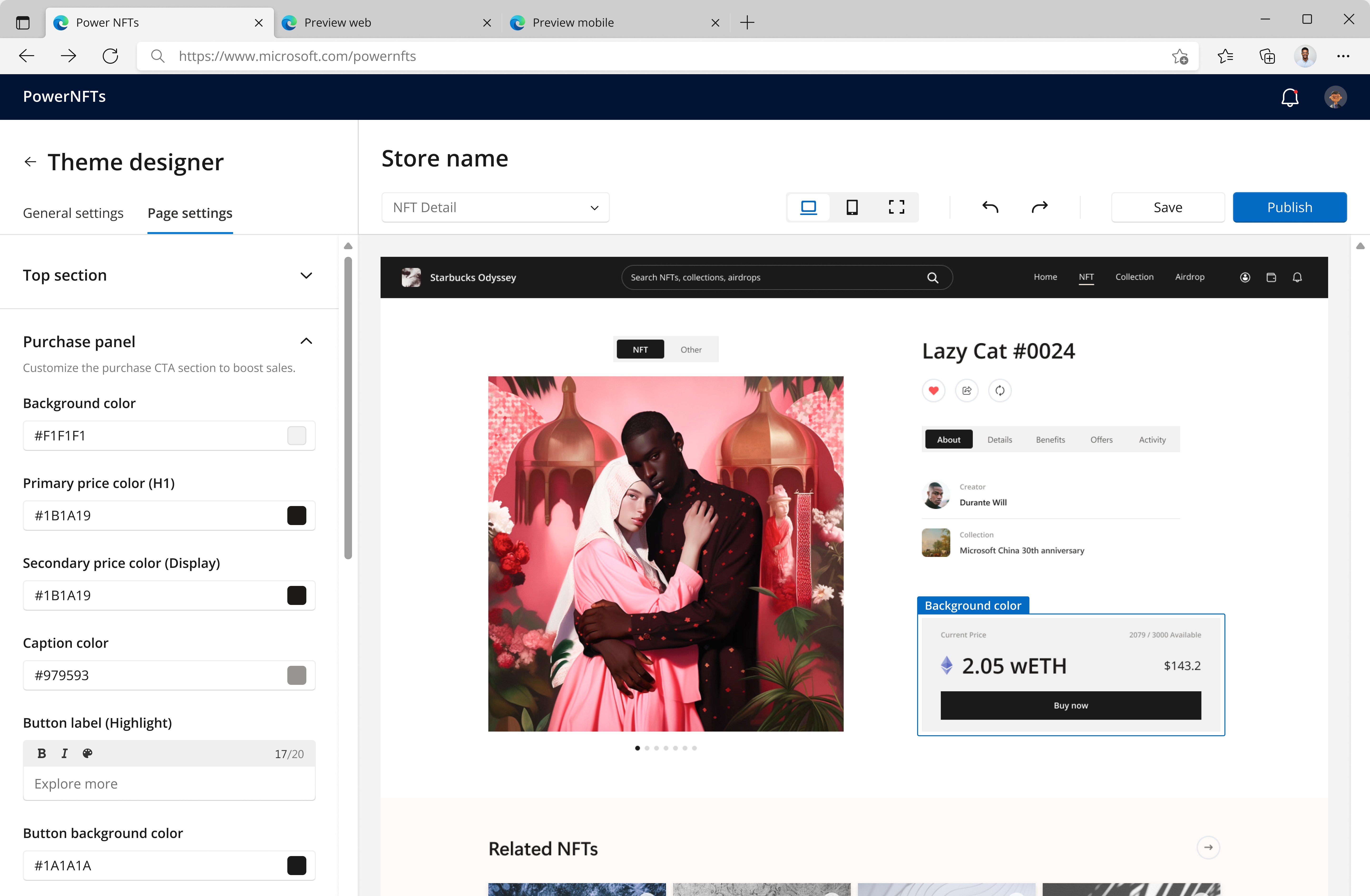
Page Settings
/
Button Settings
Card Grid Settings
Card grid settings let admins control card visual styles, such as color, shadow, and spacing. The spacing settings set horizontal/vertical gaps between cards, and the shadow settings help adjust the shadow color, offset, and blur.

Page Settings
/
Card Grid Settings
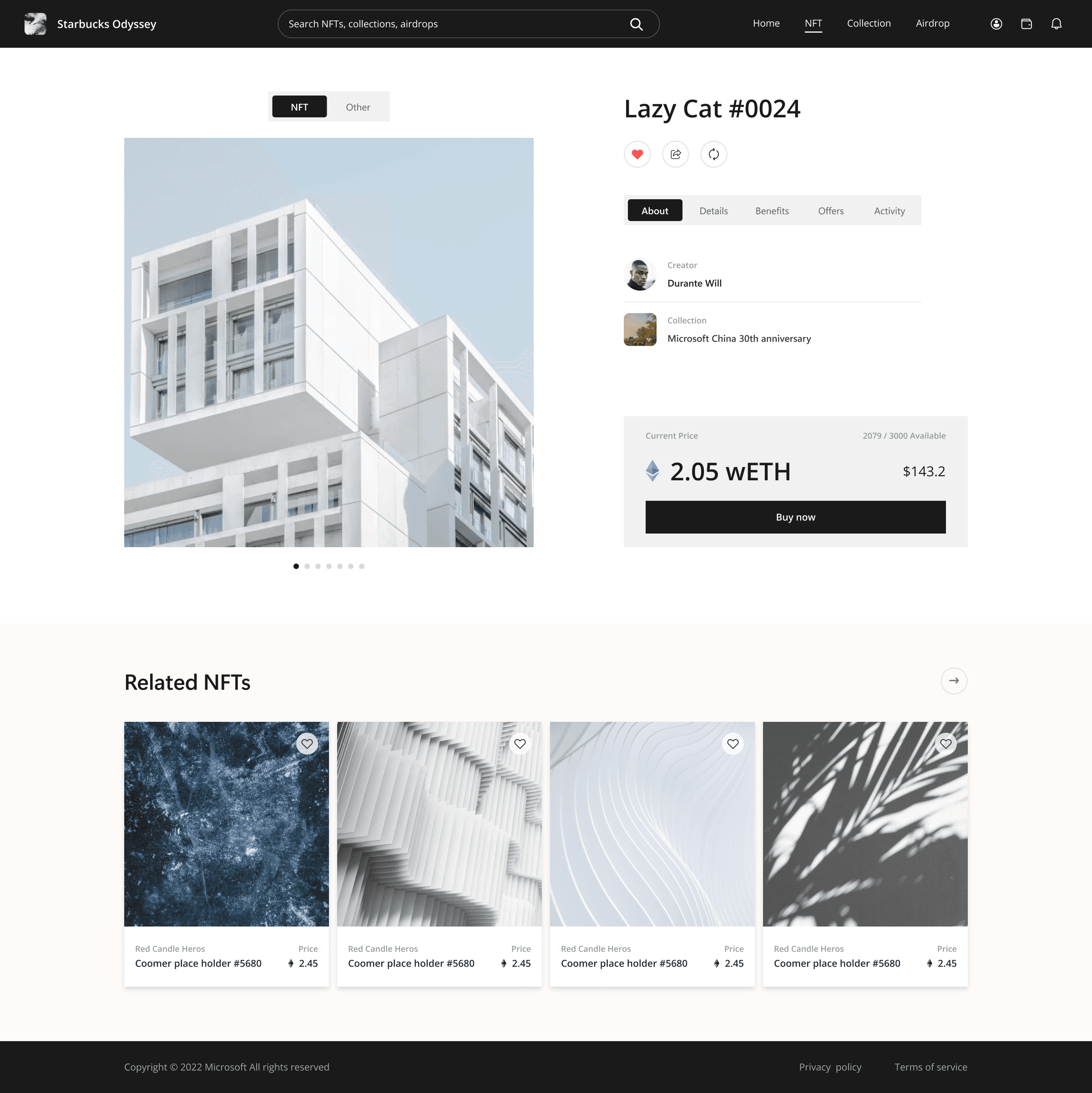
Carousel Settings
In carousel settings, admins can choose from 3 layout options and display up to 5 NFT collections to highlight the store’s offerings.

Page Settings
/
Carousel Settings
Design Iterations
Over 6 months, I kept refining the Theme Designer experience, starting from core settings like color and typography to advanced controls such as spacing and shadows, giving admins greater flexibility for storefront styling.


The Results
The Theme Designer MVP was implemented by devs in 2023. Later, it became a key PowerNFT add-on that reinforced Microsoft’s partnership pitch to major brands entering Web3, including Starbucks, Universal Studios, and Pop Mart.


